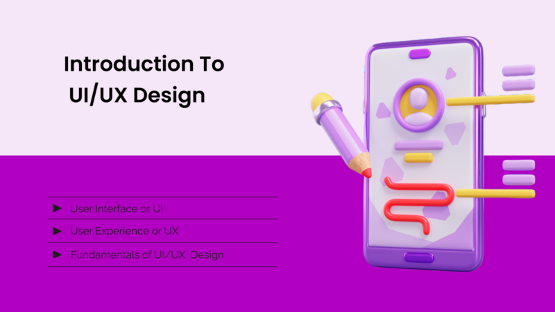
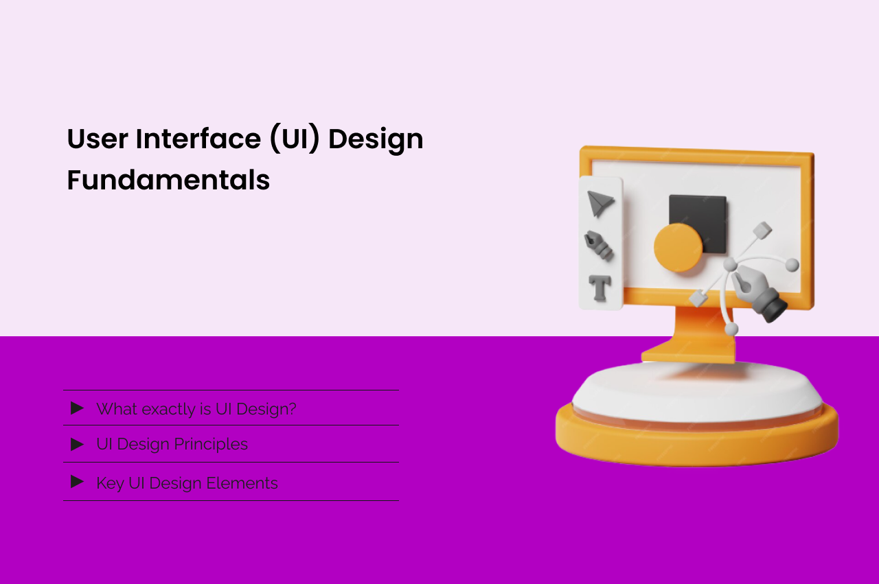
User Interface (UI) Design Fundamentals: A Beginner’s Guide:
To create a seamless user experience, creating visually appealing interfaces and intuitive designs is necessary. In this article, I am going to share some essential UI design fundamentals to get you started.
What exactly is UI Design?
User Interface or UI deals with the digital product’s visual and interactive elements. Its main goal is to make sure that users can easily navigate and engage with them.
Real UI Design Fundamentals: How Top Products Apply These Principles
Understanding UI design fundamentals in theory is one thing. Seeing how Spotify, Instagram, Apple, and Google apply them in real products is another. This section breaks down actual UI design decisions and explains the fundamental principles behind them.
Example 1: Spotify’s “Explore” Tab — Simplicity & Hierarchy in Action
When you open Spotify’s Explore tab, you don’t see 500 playlists. You see:
– 3-4 large cards at the top (featured playlists)
– A horizontal scrolling section below (“Made for You”)
– More sections below that
Which Fundamental Principle Does This Apply?
– Simplicity: Instead of overwhelming users with all content at once, Spotify shows only what’s most relevant
– Hierarchy: Large cards at top = most important. Smaller sections = secondary recommendations
– Progressive Disclosure: You can scroll to see more without being forced to see everything
Why This Matters for Fundamentals?
New UI designers often create interfaces showing everything at once. They think “more options = better.” Spotify proves the opposite. By limiting initial choices to 3-4, users make decisions faster and feel less overwhelmed.
The Fundamental Principle: Hick’s Law — The time to make a decision increases with the number of options. Limiting choices improves user experience.
Example 2: Apple’s iPhone Setup Wizard — Consistency & Clear Language
When you set up a new iPhone, Apple guides you through several screens. Each screen follows the same pattern:
– Large, clear heading at top (“Face ID” or “Password”)
– Simple explanation below
– One or two action buttons at bottom
– Progress indicator showing where you are
Which Fundamental Principles?
– Consistency: Every screen follows identical layout. Users know what to expect
– Feedback: Progress indicator shows users they’re making progress
– Clarity: No technical jargon. “Face ID” instead of “Facial Recognition Authentication”
Why This Matters for Fundamentals?
Inconsistent interfaces force users to relearn the interface on every screen. By keeping the layout, language, and interaction patterns identical, Apple lets users move through setup automatically without thinking.
The Fundamental Principle: Consistency creates familiarity, which reduces cognitive load.
Example 3: Gmail’s Compose Button — Visual Hierarchy & Accessibility
Gmail’s bright blue “Compose” button sits in the bottom-right corner. It’s impossible to miss.
Why This Design Follows UI Fundamentals?
– Color Contrast: Bright blue stands out against white background. Accessible for colorblind users
– Size: Large button makes it easy to click (Fitts’s Law: larger targets are easier to hit)
– Placement: Bottom-right is where fingers naturally rest on mobile
– Clear Language: “Compose” is more intuitive than “Create” or “New Message”
The Fundamental Principle: Make primary actions obvious. Users should never wonder how to start a task.
Example 4: Netflix’s Discovery Feed — Personalization as a Fundamental
Netflix’s home page shows you personalized recommendations based on your watch history. Every user sees a different interface.
Which Fundamental Principle?
– User-Centered Design: Interface adapts to each user’s preferences
– Progressive Disclosure: Instead of showing all 50,000 titles, Netflix shows 50-100 personalized picks
– Relevance: Only show content users actually care about
Why This Matters for Fundamentals?
Generic interfaces treat all users the same. The best UI design fundamentals require thinking about individual user needs and preferences. Netflix takes this to the extreme—every user’s experience is unique.
The Fundamental Principle: Design for the user, not for yourself.
Example 5: Instagram’s Double-Tap to Like — Discoverability of Interaction
Instagram’s heart icon indicates you can like a post. But most users discover they can double-tap to like by accident. This is a brilliant UI fundamental.
Why This Design Works?
– Affordance: The heart icon clearly signals “you can interact here”
– Hidden Interaction: The double-tap is a bonus discovery. Reduces cognitive load for first-time users
– Natural Gesture: Tapping twice feels natural, matches other mobile patterns
The Fundamental Principle: Affordance — design should indicate how to interact without explicit instructions.
Key Takeaway on Fundamentals in Real Products:
Every major tech company obsesses over UI design fundamentals because they know:
– A confusing interface loses users instantly
– A well-designed interface becomes invisible (users don’t think about it)
– Fundamental principles aren’t opinions—they’re based on human psychology and ergonomics. The products that seem simple are actually engineered carefully around principles like hierarchy, consistency, simplicity, and accessibility
UI Design Principles:
Principles are necessary to work with anything. We have to follow every principle to make our product exceptional. Here are some important User Interface(UI) principles,
- Clarity: We have to make sure that typography is clear, the labels are concise, and the icons are intuitive. We have to be clear and simple so that the user will experience a seamless design.
- Consistency: The design patterns and elements should be uniform throughout the design. Remember that consistency is the key!
- Color: Colors have a very crucial impact on designs and ultimately on users. We should opt for purposeful color schemes guiding user attention.
- Contrast: We should choose sufficient contrast for readability. As we all know, our purpose is to keep things simple and easy to use so that we can attract more users.
- Alignment: We should pay strong attention on organization of the layout for visual flow. The better the layout, the better the design.
10 Critical UI Design Mistakes Beginners Make (And How to Fix Them)
UI design fundamentals seem straightforward until you start building. Then you realize hundreds of small decisions impact the user experience. Here are the 10 most common mistakes beginners make—and how professional designers fix them.
Mistake 1: Designing from the Desktop Down (Instead of Mobile-First)
Many beginners design on desktop with a 1920×1080 canvas, then try to “shrink” the design for mobile.
Why This Fails:
The desktop has space for everything. Mobile forces you to prioritize. If you design desktop-first, you end up with:
– Too many options on mobile
– Text that’s too small
– Buttons that are too close together
The Fix (Mobile-First Design):
Start on mobile (375px width). Force yourself to:
1. Choose your 3 most important features
2. Hide or defer less important ones
3. Make tap targets at least 44×44 pixels (minimum)
4. Use only essential text
Then scale up to tablet and desktop. This ensures mobile users (who are 60-70% of traffic) get the best experience.
Mistake 2: Using Too Many Fonts
Beginners often use 4-5 different fonts, thinking it adds personality. It actually looks chaotic.
Why This Fails:
Multiple fonts compete for attention. Users get distracted by inconsistent styling instead of focusing on content.
The Fix:
Use exactly 2 fonts:
– 1 font for headers (serif or display font for personality)
– 1 font for body text (sans-serif for readability)
Example: Google uses Roboto everywhere. Apple uses San Francisco. Netflix uses Netflix Sans. One font = clear identity.
Mistake 3: Ignoring Contrast & Accessibility
Beginner mistake: Light gray text (#CCCCCC) on white background because it “looks elegant.”
Why This Fails:
– Users with vision impairment can’t read it
– Low contrast violates WCAG accessibility standards
– Even sighted users struggle with eye strain
The Fix:
Use a contrast ratio of at least 4.5:1 for normal text (WCAG AA standard). Tools:
– WebAIM Contrast Checker (free)
– Accessible Colors Tool
Test with: Squint at your design. Can you read the text? If not, contrast is too low.
Mistake 4: Buttons That Don’t Look Clickable
Beginner mistake: Buttons with no border, no background color, no shadow. Just text.
Example: “Click Here” in black text on white background.
Why This Fails:
Users don’t know they can click. They move on to another action.
The Fix:
Use visual indicators that something is clickable:
– Distinct background color (different from surrounding elements)
– Clear hover state (color changes, shadow deepens, etc.)
– Adequate padding (at least 12px around text)
– Cursor changes to pointer on hover
Mistake 5: Inconsistent Spacing
Beginner mistake: One button has 8px padding, another has 16px. Elements are randomly spaced.
Why This Fails:
Inconsistent spacing looks unprofessional and breaks the visual hierarchy.
The Fix:
Use a spacing system. Choose one number and multiply it:
– Base unit: 8px
– Spacing values: 8px, 16px, 24px, 32px, 40px, etc.
– All elements use these values only
This creates rhythm and makes the interface feel intentional.
Mistake 6: Too Much Information on One Screen
Beginner mistake: Cramming everything users might need onto the homepage.
Why This Fails:
Cognitive overload. Users see 20 options and don’t know where to start. They leave.
The Fix:
Use Progressive Disclosure:
1. Show only critical information first
2. Hide secondary info in dropdowns, tabs, or second screens
3. Let users reveal more when they need it
Example: Google’s homepage shows a search bar + logo. Everything else is hidden. Simplified.
Mistake 7: Using Placeholder Text in Final Designs
Beginner mistake: Leaving “Lorem ipsum” text in the final design. Buttons say “Button.” Images show gray boxes.
Why This Fails:
You don’t see how the design actually works with real content. Real text is longer than placeholder text. Real images break layouts.
The Fix:
Always use real content (or realistic substitutes):
– Real product names
– Real product descriptions
– Real images in actual dimensions
– Real user data
This reveals problems before launch.
Mistake 8: Ignoring Feedback & Validation
Beginner mistake: Assuming your design is good without testing it. Users click the wrong buttons or miss critical information.
Why This Fails:
You’re not the user. Your mental model differs from theirs.
The Fix:
Test with 5 real users:
1. Ask them to complete a task (e.g., “Find the pricing page”)
2. Don’t explain how to use it—they should figure it out
3. Watch where they get confused
4. Fix those problems
A 20-minute test with one user reveals problems your team missed.
Mistake 9: Not Using a Design System
Beginner mistake: Every page designs buttons, inputs, and cards differently.
Why This Fails:
Inconsistent experiences confuse users. Every page feels like a different product.
The Fix:
Build a design system (even if it’s simple):
– Define 1 button style (colors, sizes, states)
– Define 1 input style
– Define 1 card style
– Use these everywhere
Larger companies use systems like Material Design or iOS HIG.
Mistake 10: Designing Without Constraints
Beginner mistake: Unlimited space, unlimited colors, unlimited possibilities.
Why This Fails:
Constraints force creativity. Without them, designs become bloated.
The Fix:
Set constraints:
– Max 3 colors (+ black/white/grays)
– Max 2 fonts
– Max 8 sizes for spacing
– Max 3 button states
Constraints = better, more focused designs.
Key User Interface(UI) Design Elements:
There are a few elements that we have to keep in mind while designing the product. They are;
- Typography: Font styles, sizes, and spacing.
- Buttons: Clickable elements for actions.
- Forms: User input fields and labels.
- Navigation: Menus, tabs, and breadcrumbs.
- Feedback: Visual cues for user interactions.
UI design fundamentals are universal, but their application varies wildly depending on the industry. A banking app’s UI design needs different principles than an Instagram clone.
Financial Services & FinTech UI Design
Core Principle: Security, clarity, and trust
What matters most:
– Clear account information (users need to verify balance, transactions)
– Obvious confirmation steps (no accidental transfers)
– Trust signals (security badges, encryption indicators)
Examples of industry-specific fundamentals:
– Every number should be easy to read (high contrast, large font)
– Transaction history should show full details (amount, date, recipient)
– Critical actions need confirmation dialogs
– Password/biometric authentication must be obvious
– Error messages must explain clearly what went wrong
UI Design Mistake in FinTech:
Making transfer buttons flashy/colorful (it creates stress, not delight)
Real Example: Revolut’s app uses muted colors + large, clear numbers. Every action has confirmation. This builds trust.
E-Commerce UI Design
Core Principle: Conversion, urgency, and clarity
What matters most:
– Product visibility (clear images, zoom capability)
– Reduced checkout friction (minimal fields, guest checkout)
– Urgency signals (limited stock, countdown timers)
Examples of industry-specific fundamentals:
– Product images should be large and zoomable
– Price should be visible without scrolling
– “Add to Cart” button must be obvious
– Checkout should be 1-3 steps max
– Trust signals (reviews, secure payment badges)
UI Design Mistake in E-Commerce:
Hiding reviews/ratings (leads to lower conversions)
Real Example: Amazon’s homepage shows product image, price, rating, and buy button above the fold. Everything users need to decide is visible immediately.
SaaS (Software-as-a-Service) UI Design
Core Principle: Productivity, learning curve, and power-user features
What matters most:
– Onboarding (new users need to get productive fast)
– Power-user features (advanced users need shortcuts)
– Customization (different roles need different views)
Examples of industry-specific fundamentals:
– Onboarding tutorial on first login
– Command palette or search for power users
– Keyboard shortcuts for common actions
– Settings that actually match user needs (not just options for options’ sake)
– Clear navigation showing where you are
UI Design Mistake in SaaS:
Overloading beginners with advanced features (they get overwhelmed)
Real Example: Slack prioritizes simplicity for new users but offers keyboard shortcuts for power users. Both groups are satisfied.
Healthcare UI Design
Core Principle: Safety, privacy, and clarity
What matters most:
– Privacy signals (reassure patients about data security)
– Clear medical information (no jargon)
– Accessibility (many users are elderly)
Examples of industry-specific fundamentals:
– HIPAA compliance indicators
– Large, readable text (many users have vision issues)
– Simple navigation (elderly users struggle with complex menus)
– Clear appointment management
– Obvious emergency contact buttons
UI Design Mistake in Healthcare:
Using medical jargon (patients don’t understand “myocardial infarction,” they understand “heart attack”)
Real Example: Teladoc’s app uses large buttons, simple language, and a prominent “Call Doctor Now” button—no confusion about what to do.
Social Media UI Design
Core Principle: Engagement, discovery, and habit formation
What matters most:
– Infinite scroll (keep users scrolling)
– Like/comment buttons are obvious
– Notification badges signal new content
– Recommendation algorithms suggest what’s next
Examples of industry-specific fundamentals:
– Immediate feedback when you like/comment (visual confirmation)
– “Like” and “Comment” buttons are large and colorful
– Notifications are prominent
– Discovery feed recommends content you might like
– Share button is easy to access
UI Design Mistake in Social Media:
Making engagement actions hidden or hard to find (kills engagement)
Real Example: Instagram’s heart icon is large and colorful. Double-tap feedback is instant and satisfying. This drives massive engagement.
Mapping & Navigation UI Design
Core Principle: Wayfinding, clarity, and real-time updates
What matters most:
– Maps are large and clear
– Directions are obvious
– Real-time updates (traffic, arrival time)
– Simple route selection
Examples of industry-specific fundamentals:
– Map should be 60%+ of the screen
– Next turn should be at the top
– Distance/time remaining should be obvious
– Search should be fast
– Alternative routes should be offered
UI Design Mistake in Mapping:
Centering the map on current location (confusing because you can’t see the route ahead)
Real Example: Google Maps shows the map prominently, next turn at top, real-time traffic overlay, and simple alternative route cards.
Design Fundamentals That Cross All Industries
Despite industry differences, some fundamentals are universal:
– Clarity: Users should understand what to do without instructions
– Consistency: Every section should follow the same patterns
– Feedback: Every action should give feedback (success or error)
– Accessibility: Designs should work for everyone (colorblind users, elderly users, etc.)
– Performance: Apps should load fast (users abandon slow apps in <3 seconds)
User Interface(UI) Design Process:
The UI design process is somewhat similar to the User Experience design process. As the UX focuses on the user experience, UI focuses on the visuals! Here are the steps of the UI design process;
- Research: Understand users, goals, and context. As the name clearly shows, researching users’ needs, preferences, interests or behaviors. It is mostly the research work that we have to do the best so that we can get an idea of what the user exactly wants! When we get the idea, we can design better to meet the user’s needs. We keep in mind what users expect from us and design accordingly.
- Wireframing: Low-fidelity sketches. In wireframing, we create basic visuals. We decide the layout, design patterns that we’re going to use, typography, and everything to have an idea of what we are going to make. We usually share the wireframes first with the customers, before we deliver the actual design. We can have an idea about how our product is going to look by just looking at the wireframes.
- Prototyping: Interactive, high-fidelity designs. It is the most important topic. Prototyping deals with the interactions of almost everything that is on our product, website, or service. It deals with how things flow. At the initial stages, we use these to develop interactive mockups for testing purposes. But, prototyping is more than that!
- Testing: User feedback and iteration. We should conduct user testing. In which we test our product before launching it. If the tests are all cleared, we can launch our product. Otherwise, we need to work on it more before releasing it.
- Refining: Finalizing design details. Once the design has passed all the user testing and feedbacks, We finalize the design and launch the product.
Tools for UI Design:
Some famous tools that we use for User Interface(UI) designing are as follows;
- Sketch
- Figma
- Adobe XD
- InVision
- Photoshop
Emerging Trends:
As the technology is growing, so does the design trends. Every new era has its new trends. We have to stay updated with the ongoing trends to be better in the design game. Some trends that are emerging nowadays are:
- Dark Mode: Designing for low-light environments. I think we all are familiar with dark mode.
- Variable Fonts: Dynamic typography. In this, we can edit our fonts manually. We can create the font of our choice!
- AR/VR Design: Designing immersive experiences.
- Voice UI: Designing for voice-activated interfaces.
Common UI Design Mistakes:
Here are a few mistakes that I’ve seen so many times.
- Poor Typography: Not choosing the right font results in poor typography. As colors represent mood, fonts also represent the aesthetics of the product.
- Insufficient Contrast: We have to make sure about contrast. A little mistake in contrast can destroy the whole design.
- Over-Cluttering: Many designers make their designs so intense that all we see is just design! As I always say, keep it as simple as possible.
- Inconsistent Design: This mistake is the biggest, in my opinion. Inconsistent design destroys the whole image of product.
- Ignoring Accessibility: If it is not accessible, then why are we designing? Where is the user experience if the product is not even accessible to the users? We have to make sure our design is accessible to users before we make it the best!
To wrap it up, we can say that mastering UI design fundamentals is crucial for creating engaging, user-friendly interfaces. Remember, effective UI design is a balance of aesthetics and functionality.
DON’T forget the three things I told you earlier,
- The simple the design, the better it is.
- A pen and paper are your best friends.
- Copy others to practice and be better in the design game!